Conversion Rate Optimisation (CRO)
-
Online Education Website
Oxbridge

Richard Brennan
Head of Digital Marketing at Oxbridge
01/ Summary
Headquarters
Birmingham, UK
Industry
Online Education
Product
Website
Oxbridge Home Learning is an online education provider offering flexible courses including GCSEs, A-levels, and professional qualifications. They cater to distance learners seeking accessible education options, providing personalised tutor support and extensive resources.
02/ Business Goal
Increase conversion rate by 30% in next 6 months
03/ Challenge
This optimisation effort will involve analysing current funnel performance, identifying drop-off points, and implementing data-driven improvements to enhance the bottom-of-funnel experience for potential students.
04/ Services
CRO Research
CRO Roadmap
A/B Testing
Website Optimisation

04/ Research Insights
01
Analytics data reveals a critical issue in Oxbridge Home Learning's purchase funnel.
An alarming 96% of user sessions do not progress to the 'add to cart' stage, indicating a severe drop-off at the initial phase of the conversion process.
This figure also represents the highest abandonment rate in the entire purchase funnel.

02
Oxbridge Home Learning's course catalog is extensive, with a select number of top course pages attracting the majority of website traffic.
These popular courses are experiencing moderate levels of user engagement.
This concentration of traffic suggests an opportunity to optimise high-performing pages for better conversion, while also indicating a potential need to improve visibility and appeal of other courses in the catalog
03
User engagement analysis reveals significant drop-off points on key pages. On the Homepage, 50% of users abandon after the second fold.
Course pages show 25% of users leaving after passing the Add to Cart button, while 50% never reach the user review section.
These findings indicate critical areas for improving content layout, call-to-action placement, and overall user journey to enhance engagement and reduce abandonment rates.
"We combined high-impact tests with multiple quick wins for efficient testing."

05/ We identified several high-impact tests
01/ Course Page - Above the fold
Hypothesis
By redesigning above the fold of the course page, restructuring layout and content presentation, visitors will experience reduced confusion and increased engagement, thereby decreasing the 96% drop-off rate and improve course enrolment conversions.
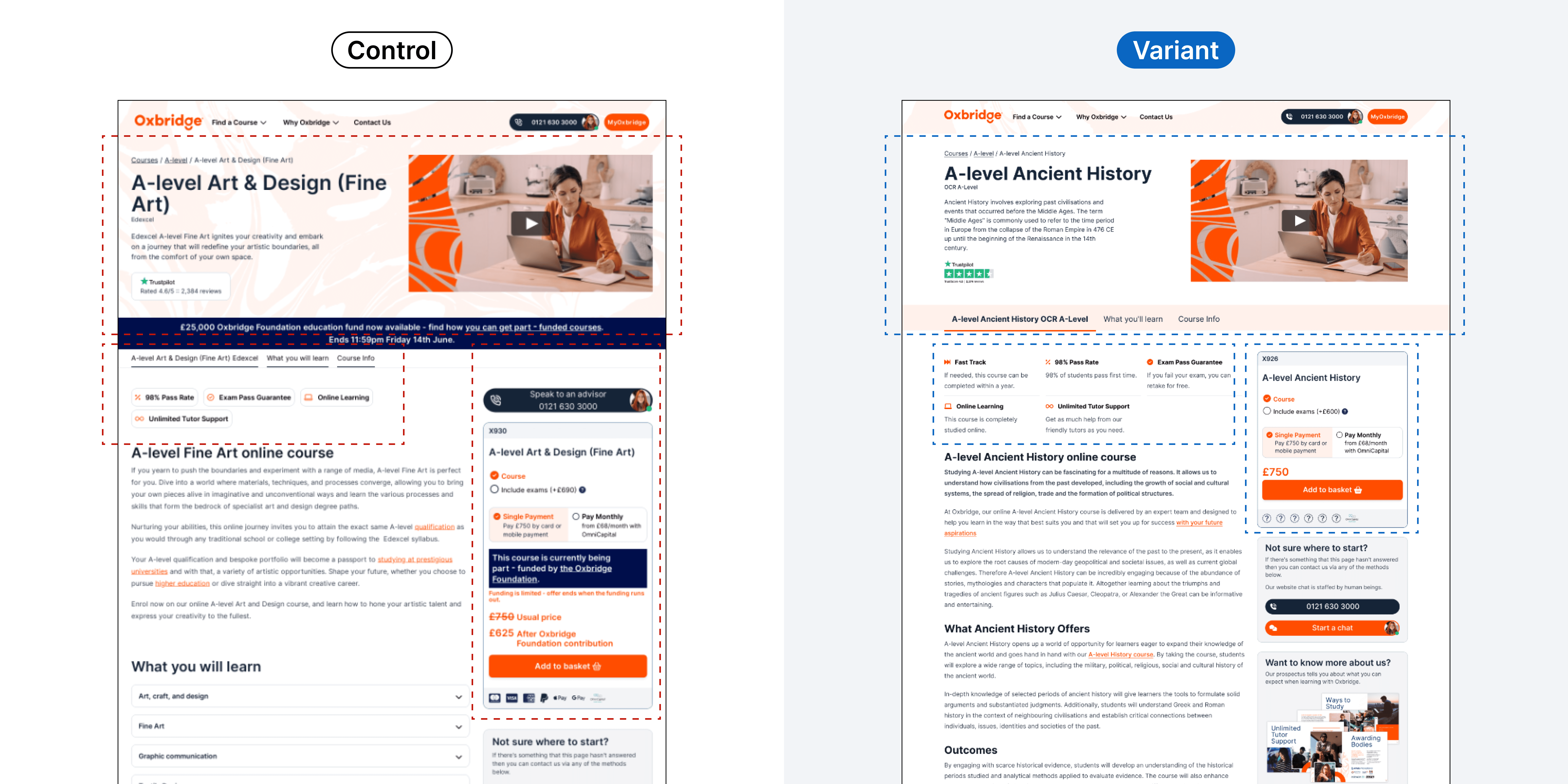
Test Results
Improvement
+40.44%
Increase in add to cart
Primary Goal
Add to cart
Test Type
A/B Test - 50:50 traffic split
02/ Checkout - Checkout Flow
Hypothesis
By streamlining the checkout process, adding clear CTA, guiding users to fill out student information more intuitively, clearly presenting pricing information, and providing reassuring trust signals, visitors will experience a smoother, more confident, and less confusing purchasing journey, thereby increasing completion rates and reducing cart abandonment.
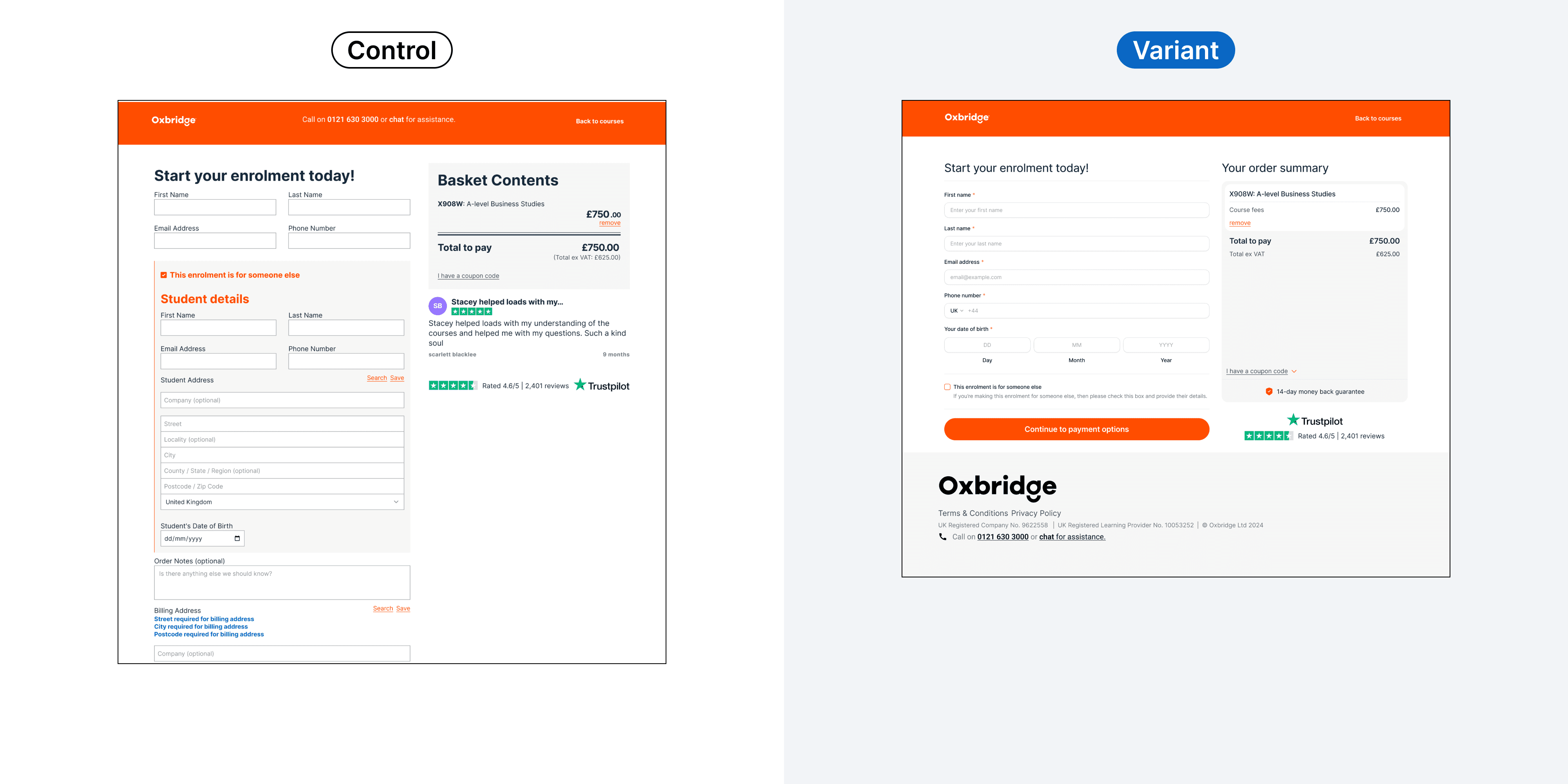
Test Results
Improvement
+30.70%
Increase in revenue
Primary Goal
Purchase
Test Type
A/B Test - 50:50 traffic split
03/ Product Page - Buybox
Hypothesis
By clarifying cost structure, enhancing CTA visibility, highlighting payment options, and improving overall buybox design, visitors will experience reduced confusion and increased confidence in their purchase decision, thereby increasing conversion rates.
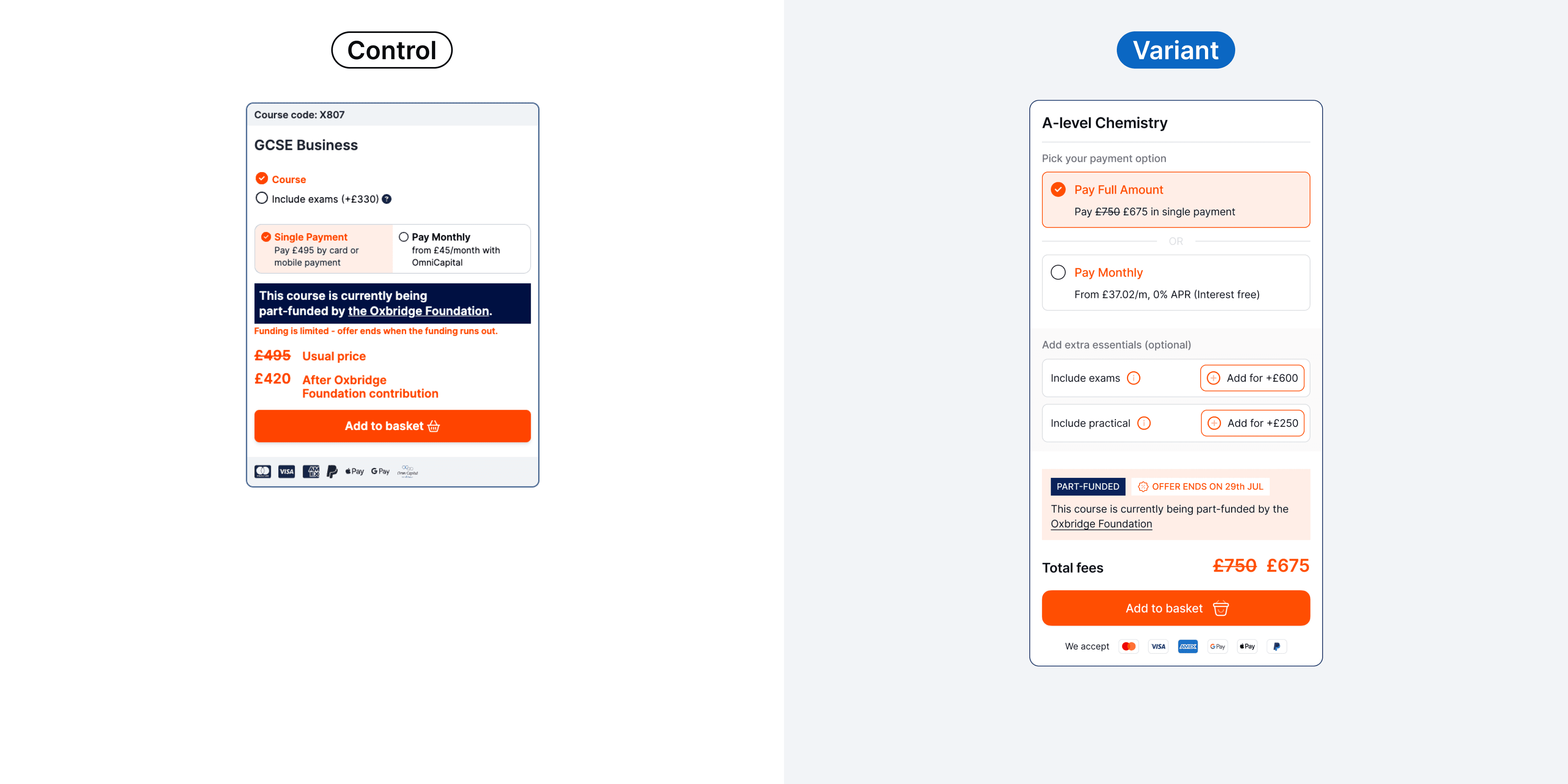
Test Results
Improvement
+10%
Increase in revenue
Primary Goal
Add to cart
Test Type
A/B Test - 50:50 traffic split
04/ Sitewide - USP Bar
Hypothesis
We believe that adding prominent Unique Selling Propositions (USPs) directly below the header will improve the immediate clarity on the site’s value. This will differentiate the brand from competitors and better inform user decisions.
We will know we are successful when we see an increase in key performance indicators, such as conversion rates and improved user feedback about perceived value.

Test Results
Improvement
+44.08%
Increase in revenue
Primary Goal
Purchase
Test Type
A/B Test - 50:50 traffic split
05/ Checkout - Monthly Payment Method
Hypothesis
We believe that enhancing the visual hierarchy, simplifying language, improving form usability, and providing clear trust signals for users making online payments will reduce user confusion, build trust, and increase conversion rates.
We will know we are successful when we see an increase in completed payment forms, a reduction in user drop-off rates, and improved user feedback on the clarity and trustworthiness of the payment process.
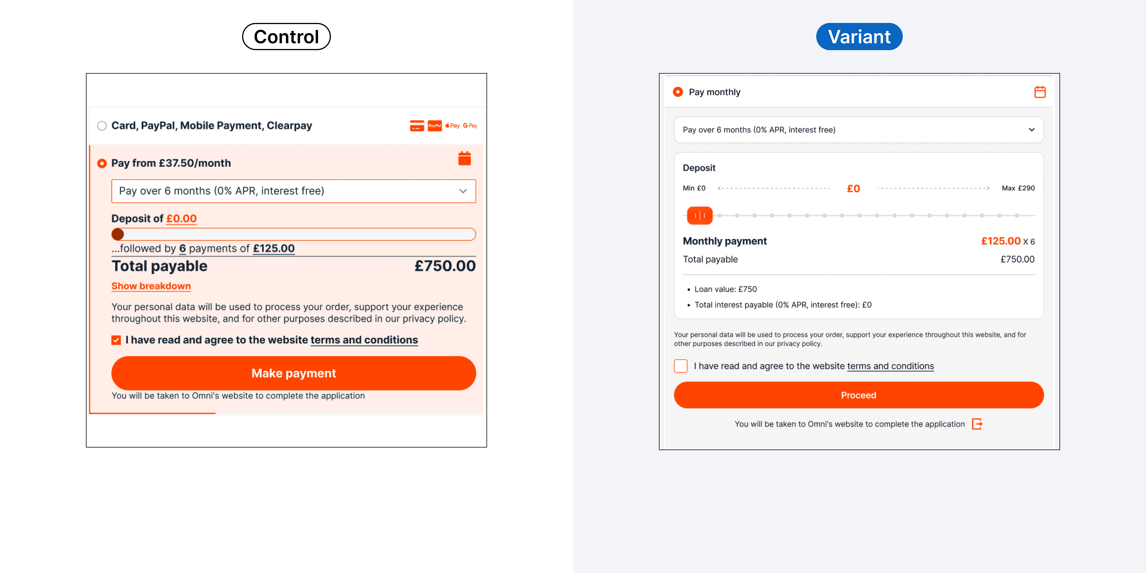
Test Results
Improvement
+23.81%
Increase in revenue
Primary Goal
Payment Form Submissions
Test Type
A/B Test - 50:50 traffic split
06/ Sitewide - Navigation Menu
Hypothesis
We believe that simplifying and optimising the navigation structure to help users find their desired courses more efficiently will reduce friction and improve conversions. From Clarity heatmaps and session recordings, we observed that users must click through multiple links and pages to locate courses, causing frustration and drop-offs.
We will know we are successful when we see a reduction in navigation drop-offs, an increase in course page visits, and higher conversion rates for course enrolments.
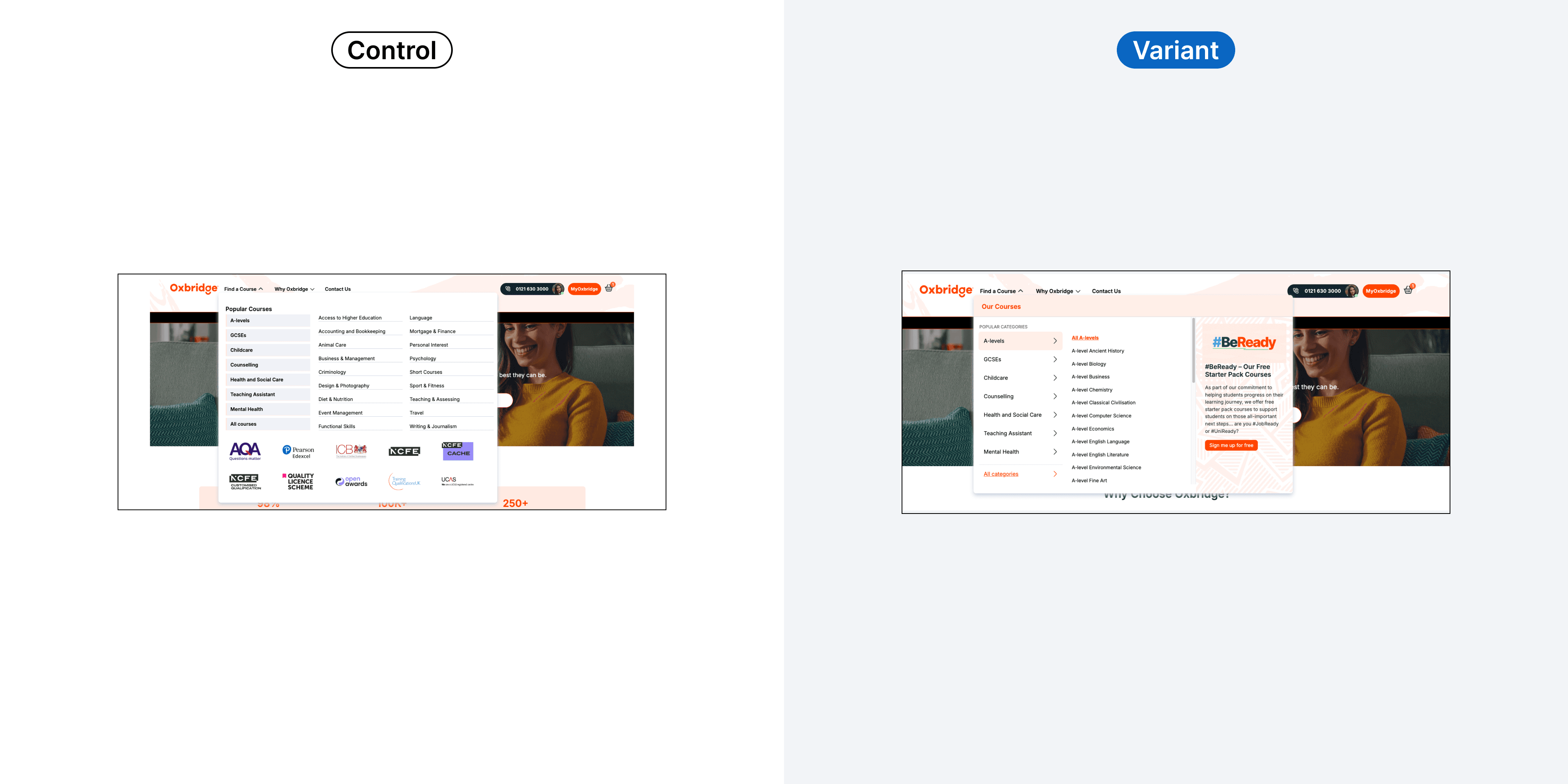
Test Results
Improvement
+19.78%
Increase in revenue
Primary Goal
Purchase
Test Type
A/B Test - 50:50 traffic split
06/ Continue with other case studies